The Chart Data Model
In This Topic
Nevron Chart for Reporting Services is a custom report item. In order to better understand how to work with the chart and bind it to data you should have a general understanding of custom report items and the data model they use.
Each custom report item in general has a design model and runtime state. The design model of the item defines how it merges with the actual data, which is provided at runtime. The runtime state represents the report item when the data has been processed by reporting services and merged with the design model of the item.
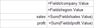
Custom report items are similar to the Matrix report item. Custom report items are composed by hierarchically organized row and column data groupings. Because not every Matrix model is suitable for charting, Nevron Chart for Reporting Services uses a simplified model, which is better suited for this purpose. Figure 1 illustrates the design model of the chart:
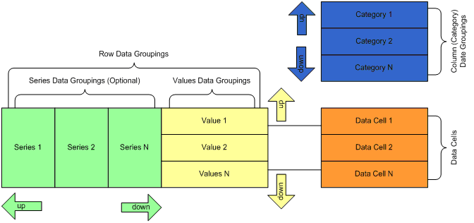
Figure 1 - The Chart Data Model
There are three types of data groupings - categories, series and values. Category data groupings define how the data cells expand in the column direction. Collectively, the series and the values data groupings define how the data cells expand in the row dimension - i.e. form the set of row data groupings.
Categories and series data groupings are dynamic - this means that they are constructed to represent a grouping of the data based on some expression conditions (typically a single field value). At runtime each dynamic data grouping expands to one or more group members.
The categories hierarchy is always simple and represents a parent-child chain. Each category has exactly one parent category, except the root category, which has no parent category. Each category has exactly one child category, except the last category, which has no children. For example: Category 1 is a parent of Category 2 and Category 2 is the one and only child of Category 1. Moving categories up and down from the visual interface in fact makes changes in this parent-child chain (for example: moving Category 2 up makes Category 2 the root category. Category 1 becomes the only child of Category 2 and if Category 2 had a child it becomes a child of Category 1).
The series hierarchy is identical to the categories hierarchy. The only difference is that values data groupings are always kept to be children of the last series data grouping (if any) - i.e. the last series data grouping can have an unlimited number of values data grouping children.
Values data groupings are static - this means that exactly one group member is created for each values data grouping in the context of a given series grouping member at runtime. In Nevron Chart for Reporting Services each values data grouping typically represents a single chart series. Values data groupings are always children of the last series data grouping. Moving values up and down from the visual interface, results in changing the order of these values in the last series data grouping. If there are no series data groupings, values are simply arranged in the row data groupings collections of the custom report item.
A single data cell is associated with each values data grouping. Adding, removing or moving a values data grouping always results in adding, removing or moving the associated data cell. At runtime each row of evaluated data cells represents the data points that the values data grouping member uses to display the chart series.
Examples
Too complex? Lets see some samples. Consider this data set:
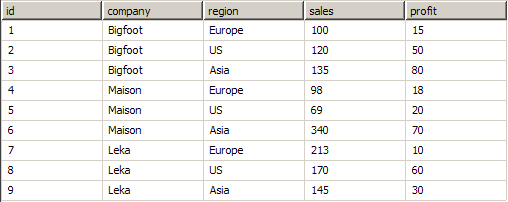
Company names and data are fictional.
Each company has sales and profit in the Europe, US and Asia regions. First consider a Matrix report item at design and runtime:
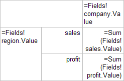
Matrix1 Design Time:
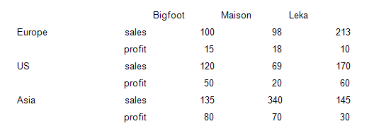
Matrix1 Runtime:
This sample is easily translated to a Nevron Chart report item like this:
- The chart has one category data grouping, which groups data by the company field value.
- The chart has one series data grouping, which groups data by the region field value.
- The chart has two values data groupings - one for the sales and one for the profit. The chart has two data cells associated with these values data groupings. The first shows the sum of the sales field for the company/region intersection. The second shows the sum of the profit field for the company/region intersection.
Following is a sample visualization of this data model (uses a Clustered Column Chart).
Chart1 Design Time:
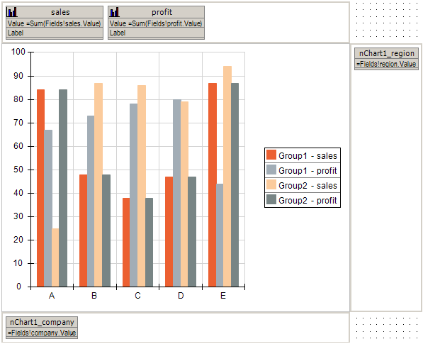
Chart1 Run Time:
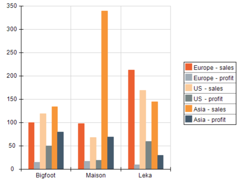
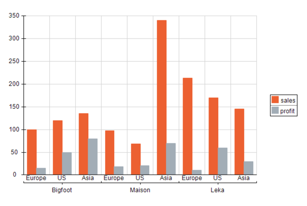
Lets see what happens, if we make the region data grouping a child of the company data grouping:
Matrix2 Design Time:
Matrix2 Runtime:
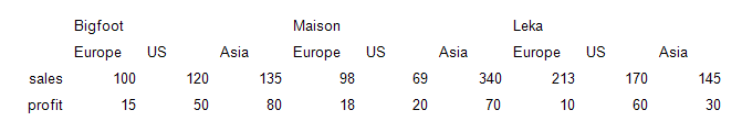
Chart2 Design Time:
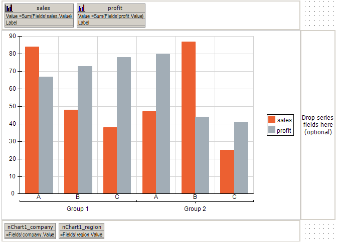
Chart2 Runtime:
Data Cells and Chart Data Points
At runtime each row of evaluated data cells represents the data points for a single chart series. At runtime each values data grouping instance evaluates to a single chart series, which uses these data points.
There are only a few charting types, which do not follow this rule (for example: the pie charts, funnel charts, Grid and Mesh surface charts etc.). The documentation for each of these charting types highlights the differences from the general rule.
Different charting types (chart series types) have different data point requirements. In reporting services each data cell can contain multiple values. In the examples seen above the data cells have only one value - the sum of the sales or profit. A single value however is not enough for many charting types - for example a XY scatter will need at least one X and one Y value for each data point. Nevron Chart for Reporting Services will automatically update the value cards (located in the top adorner panel) in order to prompt you about the needed/supported data values each data cell should contain.
Besides the charting type, which displays the data cell, the order of the data cells (i.e. the values data groupings) may also affect the needed/required data values for each data cell. For example: The XYZ Scatter Stack Column Chart will need X,Y,Z values for the first data cell and only a single Value for the next data cells, which are displayed in the stack. The documentation for each charting type splits the data cells requirements to the "first in chart" and "next in chart" categories, whenever there is a difference in these requirements.
In the case of a single chart area, there is only one "first in chart" data cell - the one that is associated with the first values data grouping. In the case of multiple chart areas - there are multiple "first in chart" data cells - one per each charting area.
See Also