The Chart Visual Interface
At report design time, Nevron Chart for Reporting Services appears as a report item in the Report Items section of the Toolbox. It is represented by this icon:

When you drag and drop the chart in the report design surface, it will initially display an empty chart with three adorner panels - for the chart values, categories and series data groupings:
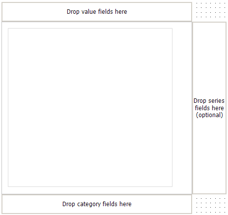
You can drop fields from the report data set on these adorner panels. You will typically drop measurement fields in the values adorner panel and dimension fields in the categories adorner panel.
All charting types will require you to drop at least one value and one category field.
You can drop fields by which values are grouped in the series adorner panel. With minor exceptions (such as the Grid and Mesh surface charting types) this operation is optional. The Chart Data Model topic explains in detail the meaning of the values, categories and series data groupings in the context of Nevron Chart for Reporting Services.
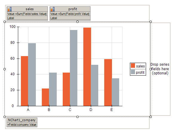
Lets assume that we have a simple data set with the following fields: company, region, sales and profit. If you drop the company in the categories adorner panel and the sales and profit fields in the values adorner panel the chart report item will look like this:
For each field that you drop the chart will create a certain type of data grouping, depending on the adorner panel on which you dropped that field. Each data grouping is represented by a card in the respective data grouping adorner panel.
The category and series data grouping cards are identical. Their header is the name of the data grouping. Nevron Chart for Reporting Services will automatically construct an unique name for the data grouping (see the Category and Series Data Grouping for more info about automatic data grouping naming). The items in a category/series data grouping card are the expressions on which you group data. By default when you drag and drop a field in the category/series adorner panels the created data grouping will have only one grouping expression - by the field value.
In the example, for the dropped company field, the category data grouping has a name: nChart1_company and a single group expression: =Fields!company.Value.
Values data groupings represent chart series. Depending on whether there are any series data groupings, a single values data grouping produces one or more chart series. The header of the values data grouping cards is the label of the values data grouping. The items in the values data grouping card are the [data series:expression] pairs that the current charting type supports for this values data grouping. It is important to know that the expression is stored in the data cell associated with values data grouping (see The Chart Data Model topic for more info). The [data series:expression] pairs will be automatically updated when you change the charting type. Located in the left-top corner is an icon, which provides you with a hint about the chart series type, which is currently used to display the values data grouping.
In the example, for the dropped sales field, the values data grouping has a static label sales, it is represented by a bar series, the Value of each bar is obtained from the result of the =Sum(Fields!sales.Value) expression (for each evaluated data cell) and the Label string for the bars is not specified.
You can drop fields on existing card items to replace the expression used by this item.
If no card is selected in the adorner panels, you can show the chart report item properties dialog by right clicking on the report item and choosing the Properties command.
The Chart Properties Dialog is constructed by hierarchically organized tabs and has a preview of the chart located on top. Changes to the actual chart report item are not applied until you press the Apply or OK buttons located at the right bottom side of the dialog.
The Chart Properties Dialog consists of the following major tabs:
- Chart tab - lets you edit the chart areas, legends, titles and all properties associated with them. The following image illustrates the Chart tab:
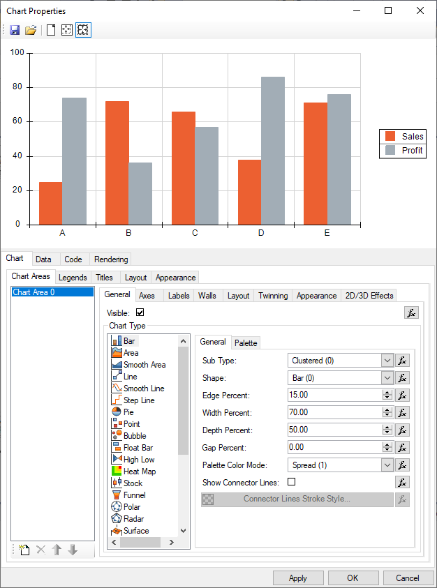
Nevron Chart for Reporting Services supports multiple chart areas, legends and titles. These chart elements are fully editable from the Chart Areas, Legends and Titles sub-tabs of the Chart tab. See the Chart Areas, Legends and Titles topics for a full description of the settings per each of these elements. The Layout and Appearance sub-tabs of the Chart tab control general layout and appearance settings, which are not associated with a particular chart area.
-
Data tab - lets you edit the category, series and values data groupings. Provides you with an option to select a data set. The Data tab is illustrated by the following image:
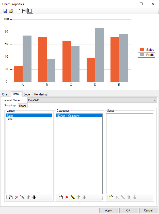
In Nevron Chart for Reporting Services values, categories and series data groupings are completely editable from the Groupings sub tab of the Chart > Data Tab. Besides the groupings, the Data tab lets you edit the global chart report item filters and lets you specify the data set to which the report item is linked. Double click on a data grouping (or select and press the edit button) to show the respective data grouping properties dialog (Category/Series and Values data grouping editors are discussed below).
- Rendering tab - lets you tune the rendering output of chart report item. For more information take a look at the Rendering Options topic.
The property editors of the category and series data groupings are identical. They can be shown in two ways:
- From the Adorner Panels - double click on a category or series data grouping card. Or click to select the card, right click to show the context menu and choose the Properties command.
- From the Chart > Data tab - double click on a category or series data grouping item. Or click to select the item and then press the edit button.
The category/series data groupings editor is illustrated by the following image:
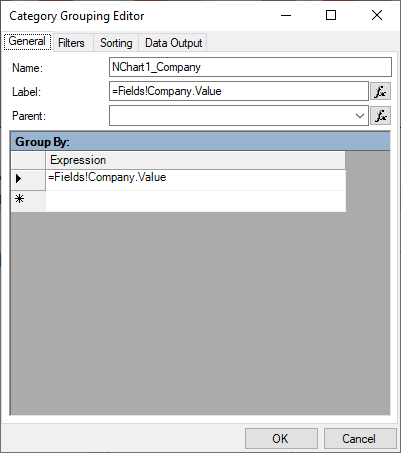
See the Category and Series Data Grouping topic for a complete description of the settings.
The values data grouping editor can be shown in two ways:
- From the Adorner Panels - double click on a values data grouping card. Or click to select the card, right click to show the context menu and choose the Properties command.
- From the Chart > Data tab - double click on a values data grouping item. Or click to select the item and then press the edit button.
The values data groupings editor is illustrated by the following image:
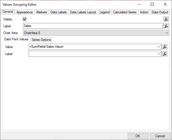
See the Values Data Groupings topic for a complete description of the settings.