Nevron Chart for SSRS is built with appearance customization in mind. The following sections discuss how appearance customization is achieved throughout the component designer interface.
Appearance Style Editors
The component exposes visual editors for the editing of fill styles, stroke styles, text styles etc. for all chart elements. Fill styles, strokes styles, text styles etc. are generally called appearance styles, which are edited with appearance editors.
The following table summarizes the appearance editors and links to the topics you can read to start working with them quickly:
Every appearance style editor has an Automatic check box located in its upper left corner. If you check it and press the Ok button of the editor, you instruct Nevron Chart for Reporting Services to determine this appearance style automatically.
All appearance styles are displayed and edited by buttons, which have a preview box in their right side. The preview box displays a checker board whenever the specific appearance style is automatically determined. By default all appearance styles are automatically determined.
Data Points, Markers and Data Label Appearance
Data series displayed by charts use a slightly more complicated method of obtaining the appearance. In the process of the determining the appearance of data points, markers and data labels the control will follow a simple, two stage process:
1. If the local chart area appearance settings (per chart area - for example Chart Areas\Chart Area 0\Appearance) are set to automatic the data series appearance will be determined by the global appearance setting (per report item - Chart \ Appearance).
2. After the series determines the style sheet they have to use they regard the Color Mode setting. The following table shows the possible settings for this mode:
| Color Mode | Description |
| Auto | The control will automatically choose between Data Point and Series mode depending on the current chart type. |
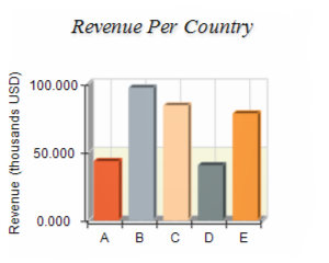
| Data Point | In this mode the palette colors are distributed across the data points. This leads to different colors per data point. |
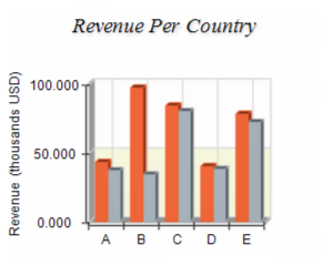
| Series | In this mode the palette colors are distributed across the series in the chart - this is useful for stack bars and stack areas. |
The following images illustrate two bar charts with color mode set to "Data Point" and "Series" respectively:
| Series Color Mode | Data Point Color Mode |
 |
 |
You can also customize the palette used to fill data points and markers by pressing the "Edit..." button next to the palette preview band. It will show the palette editor dialog:
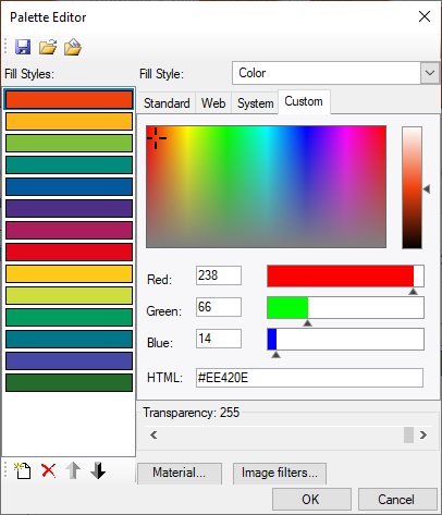
From the toolstrip at the top you can Save and Load palette definitions, as well as load predefined palettes (the third button in the strip).
In cases when you need to fine tune the targets of the style sheet you can use the following check boxes, located below the palette preview band:
Fill Markers - whether the style sheet is applied to the fill style of data point markers.
Outline Data Points - whether the style sheet is applied to the outline (stroke) of data points.
Outline Markers - whether the style sheet is applied to the outline (stoke) of markers.
Outline Data Labels - whether the style sheet is applied to the outline of data labels.
Text Appearance
Besides appearance styles XML formatted texts play central role in the chart appearance customization, since they help you display titles, headers, footers etc. in a rich text format with many options. See XML Formatted Texts for more information.