The purpose of this topic is to provide basic understanding of gauge terminology and how gauges are used in reporting.
Gauge images are composed of various elements such as gauge areas, titles, axes, ranges, pointers etc. Each of these elements is editable from the Nevron Gauge for SSRS visual interface. The following image illustrates the most common gauge elements:
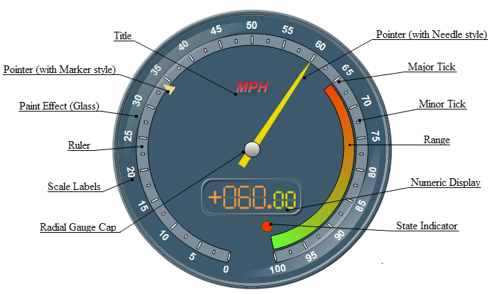
Following is a brief description of the gauge elements shown on the above picture along with a link to a more detailed topic:
Title - titles are generally used to display static text describing the contents of the gauge. For more information check out the Titles topic.
Pointers - the above picture shows two pointers - the first one is visualized as a marker with triangle shape and the second one is visualized as a needle extending from the gauge center). For more information about pointers check out the Pointers topic.
Ranges - ranges are useful to highlight important ranges of values on the gauge axes. On the above picture the range is configured to cover the range [65, 100] and uses "Start To End" gradient style. For more information about ranges check out the Ranges topic.
Major and Minor Ticks - major and minor ticks pin point values on the scale. For more information check out the Ticks topic.
Scale Labels - scale labels are displayed at the values of the major ticks on the axis.
Numeric Display - the numeric display is a type of gauge area that displays values in LED fashion. For more information check out the Numeric Display topic.
State Indicator - the state indicator is a type of gauge area that visually shows whether its value falls within a specified range. This can be useful to visually prompt the user when values on pointers, ranges or numeric displays enter critical ranges. For more information check out the State Indicator topic.
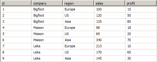
Lets assume that you have created a report that shows data from the following data source:
By default the Nevron Gauge for SSRS is configured to have one gauge area with a radial gauge with a single axis and pointer, so we will now investigate the possibilities to display some metrics of the data source. Generally, there are two strategies:
1. Tabular View - this approach displays metrics of the data source in general.
For example: to create a gauge, which shows the average sales in general do this:
- Create a Nevron Gauge Report Item by dragging and dropping the Nevron Gauge toolbox icon to the report design surface.
- Right click on the Gauge and select the Properties menu command, to open the Gauge Properties dialog.
- Go to Gauge Areas > Axes > General
- In the Data > Min field type: =Min(Fields!sales.Value). Click the Calculator button and select First.
- In the Data > Max field type: =Max(Fields!sales.Value). Click the Calculator button and select First.
- Go to Gauge Areas > Pointers > General
- In the Data > Value field type: =Avg(Fields!sales.Value). Click the Calculator button and select First.
When you click the Preview page the following gauge will show:
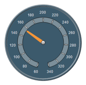
The gauge min value is actually 69, but the axis is by default snapping to the nearest tick to increase readability. You can disable snapping to tick or add marker pointers for the actual min-max.
Q. What have we done?
A. We have used the built-in statistical functions of the pivot engine. The axis-min is the minimum value found in the sales column, the axis-max is maximum value in the sales column and the pointer-value is the average of all values in the sales column.
Q. When to use?
A. When the data is already aggregated (e.g. if you use a SELECT statement with a GROUP BY clause), or when you want to display statistics for the data source in general.
1. Matrix View - this approach displays aggregated metrics of the data source.
For example: to create a gauge, which shows the average sales per company do this:
When you click the Preview page the following gauge will show:
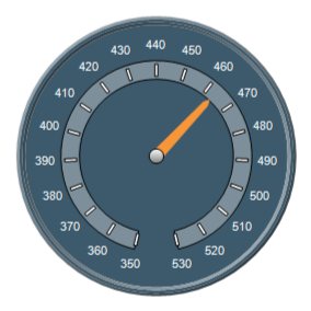
Q. What have we done?
A. We have first grouped the data by company. For the axis-min, axis-max and pointer-value we have calculated the sums of sales for each company group. Then we have used the gauge formulas to extract the min, max and average values from these lists of sums.
Q. When to use?
A. When the data is not aggregated or when you want to resample the data to extract more complex aggregate values from the data source.
In data analysis this method is known as double data aggregation.
Double data aggregation is a built-in feature of most SQL dialects (for example SQL Server and Oracle support SELECT statements with double aggregation) - so it makes sense to use them, if you connect to such data sources. Be warned however that more complex scenarios (for example: mixing double data aggregation with simple data aggregation, record and group filtering etc.) are impossible to achieve in a single SELECT statement.